
-
Research
- Experts
In The News
View All
Healthcare IT News features Dr. Thankam Thyvalikakath
Thankam Thyvalikakath, DMD, MDS, PhD, was featured in Healthcare IT...
Influence
View All
Rectal location and postcolonoscopy colorectal cancer outcomes
Published in the JAMA Network Open. Here is a link to...
- Opportunities
- Experts


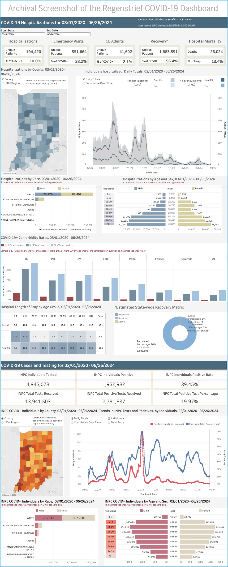
Regenstrief Institute developed the interactive COVID-19 Dashboard on March 23, 2020 to support Indiana’s public health response to the COVID-19 pandemic. The dashboard grew to inform state leaders, media and the public about the status of the outbreak across the state and was used by nearly 125,000 people in its first year.
 The Tool
The dashboard was a Tableau-based visualization application that collated information on individuals tested for and infected with COVID-19 in parallel with data on individuals with COVID-like illnesses, including influenza and pneumonia. It displayed data from a number of sources, including hospitals and clinics connected to the Indiana Network for Patient Care, managed by the Indiana Health Information Exchange.
The dashboard harmonized that collective data to inform situational awareness with respect to COVID-related testing, cases, hospitalizations, emergency department visits, intensive care utilization, mortality, recovery, comorbidity, demographics and geography.
 History
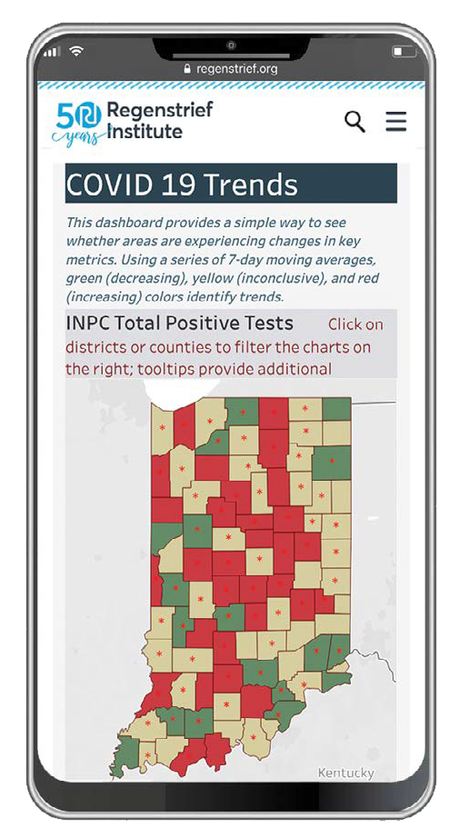
The dashboard debuted with a series of bar charts reporting individuals tested for COVID-19 or influenza. Demographics for each person were displayed using stacked bar charts, and line graphs depicted cumulative hospitalizations since the start of the outbreak. Users could filter results by selecting a geographic area of interest (e.g., county, zip code) or use a radio button to filter results to a specific diagnosis or laboratory test of interest. Users could also narrow results to a time period of interest, allowing examination of data before or after certain events, such as the governor’s stay-at-home order or the Fourth of July. These filters performed a recalculation of the descriptive statistics.
At the height of pandemic, analysts from Regenstrief’s Data Services team queried data once per day and transformed them into an analytical dataset for the dashboard. The 24/7 process of querying involved data extraction, linkage and deduplication functionality, as well as descriptive statistical calculations. As the number of cases and severity of infections decreased over four years, dashboard updates decreased to three times per week, and then once per week before the decision was made to cease operations.
The process of creating the dashboards was the subject of a peer-reviewed paper in the Journal of the American Medical Informatics Association and served as a model for other states and nations to address the pandemic and future public health crises. A later paper titled, “Dashboards Are Trendy, Visible Components of Data Management in Public Health: Sustaining Their Use After the Pandemic Requires a Broader View” was published in the American Journal of Public Health.
Awards
 Indiana Governor Eric Holcomb declared September 21-27, 2020, as Regenstrief Institute Recognition Week in thanks for its dedication to state public health.
 The institute also received the Indiana State Health Commissioner’s Award for Excellence in Public Health from Kristina Box, M.D., for its contributions to promoting and protecting the health of Hoosiers during the pandemic.
A cross-disciplinary team from Regenstrief received a Health Care Heroes award from the Indianapolis Business Journal for the institute’s work contributing to Indiana’s pandemic response.
Regenstrief was also among the finalists for TechPoint’s Mira Award for Pandemic Pivot of the Year.
The dashboard was updated for the last time on Wednesday, May 29, 2024. Should there be a re-activation of the public health emergency or a significant increase in disease burden, the dashboard may be reactivated. For official data on COVID cases and deaths, please see the State of Indiana COVID-19 Dashboard.
Data Sources

Indiana Network for Patient Care
The Indiana Health Information Exchange (IHIE) was founded in 2004, but its roots date back more than 30 years. IHIE manages the Indiana Network for Patient Care (INPC), the largest interorganizational clinical data repository in the country with a participant base of more than 100 hospitals, 50,000 providers, 18,000 practices, health networks, laboratories, and insurance providers. They represent combined data on more than 18 million patients in the form of 10 billion clinical observations, 1.1 billion encounter records, and more than 290 million mineable text reports. In addition to these clinic aspects, the INPC receives data on drugs that have been prescribed to patients within its various institutions. Approximately two-thirds of Indiana’s population is represented in the INPC.
This resource is nearly unparalleled for clinical research and includes additional data elements such as admissions, discharges, lab reports, pathology, radiology and cardiology.
Caveats (in data specific to the dashboard, this is not an exhaustive INPC caveat list)
- Not all institutions send encounter data at the same volume.
- Individual institutions may not consistently send diagnosis codes to the health information exchange.
- Patients often have multiple entries for a given demographic item. However, efforts were made to consolidate.
Indiana Department of Health Labs
The Indiana Department of Health (IDOH) maintains the State Health Laboratories for the support of State Public Health, Environmental and Food Protection programs. The State Health Laboratories provide specific, high quality, and necessary laboratory tests, test data, and test interpretations to federal, state, and local health, environmental, and food protection programs. The data from these tests is required for effective and efficient detection and response to public health, environmental and food protection emergencies and for surveillance and detection of communicable diseases, environmental hazards and their health effects, and food contaminations and their health effects.
Michiana Health Information Network
Established in 1998, the Michiana Health Information Network (MHIN) is one of the oldest and most mature health information exchanges (HIE) and healthcare information technology organizations in the U.S. With more than 20 years of longitudinal records for over 4.7M individuals, MHIN receives data contributions from more than 576 data sources across northern Indiana and southern Michigan, with over 20,304 connected providers submitting more than 3.9M inbound transactions per month. On January 1, 2020, MHIN consolidated into the Indiana Health Information Exchange (IHIE) to become Indiana’s state-wide HIE.